We often think of machine learning as a black box for prediction, but Causal ML repurposes these flexible tools for explanation. By wrapping algorithms like neural networks inside formal causal frameworks, we can estimate treatment effects without agonizing over manual model specification. This is a game-changer for identifying heterogeneity of treatment effects, moving us beyond “does it work?” to “who does it work for?”.
The core estimators in causal ML are called “meta-learners.” This is not a nod to everyone’s favorite tech company; they’re “meta” because a new algorithm isn’t invented from scratch. Instead, standard machine learning models can be plugged in to serve as building blocks in estimating the Conditional Average Treatment Effect (CATE). The CATE helps measure how a treatment’s average impact changes across different subgroups.
The most straightforward learner is the S-Learner (Single Learner). As the name implies, the S-Learner uses a single machine learning model to estimate causal effects. This model treats the treatment variable and relevant covariates as predictors of the outcome. Once the model is fit, individual treatment effects are calculated by: (1) predicting the outcome for each observation assuming treatment=1, (2) predicting the outcome for each observation assuming treatment=0, and (3) taking the difference between these two predictions for each individual. The final CATE estimate is the average of all these individual treatment effect differences.
In other words, the S-Learner estimates the outcome surface $\mu(x, t) = E[Y|X=x, T=t]$ using a single model. The CATE is then derived as $\hat{\tau}(x) = \hat{\mu}(x, 1) - \hat{\mu}(x, 0)$. Bootstrapping is a common non-parametric method to obtain valid confidence intervals of the CATE estimate.
In this tutorial, we will start by performing a causal ML analysis “from scratch” in R then repeat the analysis by leveraging Uber’s causalml package in python. The analysis will work with the df_uc_source dataset from multibias (see documentation).
R analysis
First we load the data and apply a 80-20 train-test split. Variable X_bi represents the treatment and variable Y_bi represents the outcome. There are four covariates: C1, C2, C3, and U. All variables take binary values (1 or 0).
library(multibias)
library(tidyverse)
library(tidymodels)
library(boot)

df <- df_uc_source %>%
  mutate(
    Y_bi = as.factor(Y_bi),
    X_bi = as.factor(X_bi)
  )

# split data
set.seed(123)
data_split <- initial_split(df, prop = 0.8)
train_data <- training(data_split)
test_data <- testing(data_split)
Then we create the function for obtaining the CATE from a bootstrap sample.
# Function to compute mean cate on a bootstrap sample
cate_boot_fxn <- function(data, indices) {

  boot_data <- data[indices, ]

  boot_recipe <- recipe(Y_bi ~ X_bi + C1 + C2 + C3 + U, data = boot_data)

  boot_wf <- workflow() %>%
    add_recipe(boot_recipe) %>%
    add_model(lr_mod)

  boot_fit <- fit(boot_wf, boot_data)

  boot_x1 <- boot_data %>%
    mutate(X_bi = factor(1, levels = levels(boot_data$X_bi)))
  boot_x0 <- boot_data %>%
    mutate(X_bi = factor(0, levels = levels(boot_data$X_bi)))

  pred_x1 <- predict(boot_fit, boot_x1, type = "prob")$.pred_1
  pred_x0 <- predict(boot_fit, boot_x0, type = "prob")$.pred_1

  cate_boot <- pred_x1 - pred_x0

  return(mean(cate_boot))
}
Lastly, we run this function across bootstrap samples of the train data and test data.
# Run bootstrap on training data
set.seed(123)
n_reps <- 200

boot_results_train <- boot::boot(
  data = train_data,
  statistic = cate_boot_fxn,
  R = n_reps
)

boot_ci_train <- boot::boot.ci(boot_results_train, type = "perc")

print(paste("CATE (train):", round(median(boot_results_train$t), 4)))
print(paste(
  "95% CI for CATE (train):",
  round(boot_ci_train$percent[4], 4), "to",
  round(boot_ci_train$percent[5], 4)
))

# Run bootstrap on test data
set.seed(123)
boot_results_test <- boot::boot(
  data = test_data,
  statistic = cate_boot_fxn,
  R = n_reps
)

boot_ci_test <- boot.ci(boot_results_test, type = "perc")

print(paste("CATE (test):", round(median(boot_results_test$t), 4)))
print(paste(
  "95% CI for CATE (test):",
  round(boot_ci_test$percent[4], 4), "to",
  round(boot_ci_test$percent[5], 4)
))
We arrive at the following estimates:
- Train CATE = 0.102 (95% CI: 0.096 to 0.108)
- Test CATE = 0.102 (95% CI: 0.091 to 0.116)
For observations with a treatment of X_bi=1, receiving the treatment increases their probability of Y_bi by 10 percentage points. The strong similarity in these estimates between the train and test data makes it unlikely that we’re dealing with any concerns of overfitting. One could further inspect model performance on the train and test data by observing the accuracy and ROC AUC.
Normally, in a causal ML analysis, next steps would be to plot the distribution of individual effects and investigate the heterogeneity of the treatment effect across different covariates. We’ll revisit this idea in the next section.
Python analysis via causalml
Time for some python! Please adjust your mental parsers from 1-based indexing to 0-based indexing, and trade your %>% pipes for dot notation. These analyses can be performed with the causalml package. Let’s see if we can confirm the above results and explore some of the package’s other functionalities.
As before, we start by loading the data and applying an 80-20 train test split. Note that the variable naming differs slightly from the above, as the “python convention” seems to be to name the feature matrix as X.
import pandas as pd
import numpy as np
import seaborn as sns
import matplotlib.pyplot as plt
import random

from sklearn.model_selection import train_test_split
from sklearn.linear_model import LogisticRegression
from causalml.inference.meta import BaseSClassifier
from causalml.metrics import plot_qini, plot_gain

# not shown: load df_uc_source from multibias as df

Y = df['Y_bi']
T = df['X_bi']
X = df[['C1', 'C2', 'C3', 'U']]

random.seed(123)
X_train, X_test, T_train, T_test, Y_train, Y_test = train_test_split(X, T, Y, test_size=0.2)
The user has a couple of options for creating a meta-learner in causalml. The flexible option is to use a meta-learner “parent class” and specify which algorithm serves as the learner. Alternatively, there are some S-learners in which the base model is fixed (e.g., LRSRegressor). We use the first approach by making a BaseSClassifier object with LogisticRegression as its base model. After fitting the model, the CATE can be obtained with the estimate_ate method. Parameter specification in this method ensures that we obtain a confidence interval via bootstrapping.
random.seed(123)
learner = LogisticRegression(penalty=None, solver='lbfgs')
slearner = BaseSClassifier(learner=learner)
slearner.fit(X=X_train, treatment=T_train, y=Y_train)

# cate in train
slearner.estimate_ate(
  X=X_train,
  treatment=T_train,
  y=Y_train,
  return_ci=True,
  bootstrap_ci=True,
  bootstrap_size=len(X_train)
)

# cate in test
slearner.estimate_ate(
  X=X_test,
  treatment=T_test,
  y=Y_test,
  return_ci=True,
  bootstrap_ci=True,
  bootstrap_size=len(X_test)
)
- Train CATE = 0.101 (95% CI: 0.095 to 0.107)
- Test CATE = 0.106 (95% CI: 0.094 to 0.117)
These estimates are very similar to those obtained in the R demonstration, demonstrating an average treatment effect of 10%, conditional on the covariates.
Let’s evaluate our results in the test data, starting with a plot of the density of the test CATE distribution.
cate_test = slearner.predict(X_test)
sns.kdeplot(data=pd.DataFrame({'cate': cate_test.reshape(-1)}), x="cate")
plt.title("Distribution of CATE in Test Data");
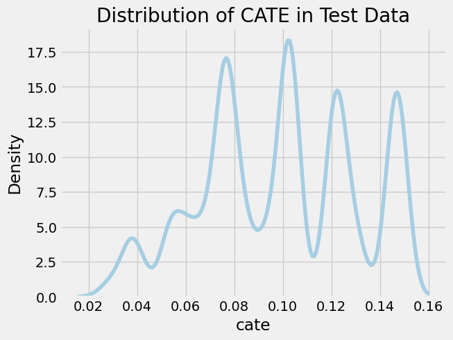
We observe several notable spikes in CATE across the distribution, each corresponding to a different sub-group in the population. We’ll analyze this heterogeneity in the treatment effect by inspecting the mean covariate value across CATE strata. We use a binary stratification here based on whether the CATE is above or below the median.
df_test = pd.DataFrame({
  'cate': cate_test.reshape(-1),
  'T': T_test,
  'Y': Y_test
}).merge(X, left_index = True, right_index = True)

df_test['cate_group'] = np.where(df_test['cate'] > np.median(df_test['cate']), "High", "Low")

df_test.groupby('cate_group')[['cate', 'T', 'Y', 'C1', 'C2', 'C3', 'U']].agg('mean')
| cate_group | cate | T | Y | C1 | C2 | C3 | U |
|---|---|---|---|---|---|---|---|
| High | 0.13 | 0.41 | 0.26 | 0.51 | 0.00 | 0.80 | 1.00 |
| Low | 0.08 | 0.27 | 0.12 | 0.50 | 0.33 | 0.80 | 0.16 |
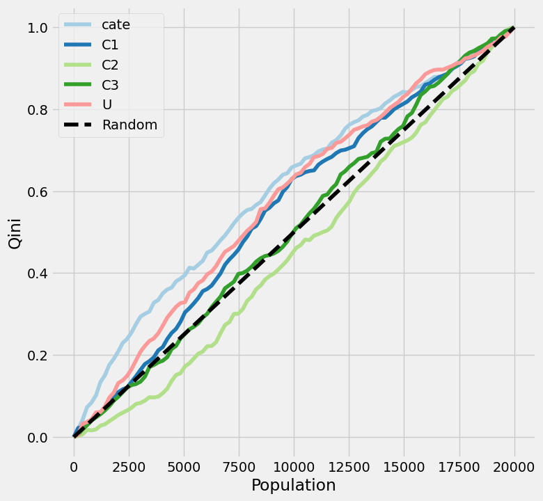
One thing immediately stands out: values of U and C2 are extremely different between the two groups! Everyone with an above-median CATE has a U=1 and C2=0. On the other hand, no real difference is observed between in C1 or C3 based on these two CATE strata. Let’s dig further dig into understanding how the covariates influence the treatment effect. There are a few nice tools within causalml to elucidate these factors. We’ll start by plotting the uplift: a visualization used to evaluate how well the causal model identifies those most affected by treatment. There are different options for the uplift metric, including Qini (Qini Curve) and Gain (Cumulative Gain Curve).
plot_qini(
  df_test.drop('cate_group', axis=1),
  outcome_col='Y',
  treatment_col='T',
  treatment_effect_col=None,
  normalize=True
)

# not shown
# plot_gain(
#   df_test.drop('cate_group', axis=1),
#   outcome_col='Y',
#   treatment_col='T',
#   treatment_effect_col=None,
#   normalize=True,
#   random_seed=123
# )
Note that treatment_effect_col is set to None. This parameter was tricky to understand in the package docs. This column should only be set to a specific column if you have a “God view” of the data and know exactly what the outcome would have been with and without treatment for every row.
A few details are relevant in understanding how to interpret these plots:
- The X-axis sequences through the population, ranked left-to-right from those considered “high responders” to those considered “non-responders” independently for each of the given variables. One line (
catein our example) will correspond to the predicted treatment effect: those with the highest predicted treatment effect respond best to treatment. The other lines will correspond to single-feature benchmarks: those with U=1 will respond best to treatment. - The Y-axis represents the cumulative uplift, which we normalized from 0-1. In other words, it shows the cumulative percentage of positive responders captured as you move down the sorted population list.
- The dotted diagonal line represents the result if you picked users randomly. This line can either be done theoretically (connection point (0, 0) to the (total population, total uplift) max) or empirically (by shuffling the data, hence why
plot_gain()has a random seed). Each feature is plotted relative to this random line.
So what does this all amount to? What are we looking for here?
- Shape. In a perfect scenario, you want a line that rises as high and as quickly as possible above the baseline, indicating that by targeting a small, highly-ranked segment of the population, you can capture the maximum incremental impact. Dips below the diagonal indicate that treatment makes subjects less likely to respond positively.
- Differences in AUC (area under the curve) between lines. If the CATE line is higher than each of the covariate lines, the model has successfully combined multiple features to find a signal that is stronger than any single variable alone. Otherwise, a simple rule (e.g., just target those with U=1) works better than the complex model.
With all of that out of the way, what are the big takeaways from the uplift plot of our data? We see that our model outperforms any of the single-feature benchmarks, at least for about 3/4 of the population. However, the model’s benefit over targeting treatment responders based solely on variable U appears modest. The C2 line matches our observation from earlier: those with a C2 value of 1 have the worst response to treatment.
I won’t go too deep on the difference between the two plots here, but I will note that Qini is based on a count-based difference in treatment effects, while Gain is based on a rate-based difference in treatment effects.
Next, we’ll take a look at the feature importance, which will tell us what predicts the uplift, not what predicts the outcome.
slearner.get_importance(
    X=X_test,
    tau=cate_test,
    method='permutation',
    features=X_test.columns.tolist()
)

# not shown
# slearner.plot_importance(
#     X=X_test,
#     tau=cate_test,
#     method='permutation',
#     features=X_test.columns.tolist()
# )
There are two different options for the feature importance method: permutation and auto. The latter is applicable for tree-based models where the estimator has a default implementation of feature importance. Since we used logistic regression for our estimator, the permutation approach was the way to go. In this estimator-agnostic approach, it calculates importance based on the mean decrease in accuracy when a feature column is permuted.
To no surprise, U and C2 have the greatest feature importance values: 0.88 and 0.70, respectively.
Discussion
To focus on the mechanics of the S-learner itself, we implemented a vanilla logistic regression. However, a significant limitation of using a standard logistic regression as the base learner without explicitly adding interaction terms is that the model assumes that the treatment effect is constant across the population. Adding interaction terms or using a tree-based model would better allow it to learn how the treatment impacts specific subgroups differently.
However, even if we used a flexible model like Gradient Boosting, S-Learners face a deeper issue known as regularization bias. If the treatment signal is weak relative to the covariates’ ability to predict the outcome, a tree-based model might simply choose not to split on the treatment variable at all. The model focuses so much on predicting the outcome that it ‘washes out’ the causal effect of the treatment. This structural reluctance to estimate heterogeneity motivates the need for T-Learners, which split the modeling process into two distinct steps to ensure the treatment effect is explicitly captured.