In Epidemiology, a lot of attention is placed on Cohort studies, perhaps because they have the clearest parallel to clinical trials. Cohort studies leverage panel data (tracking multiple entities over multiple points in time) to compare two or more treatment groups. However, an even simpler causal scenario can often arise: leveraging time series data (tracking a single entity over multiple points in time) to make a comparison before and after an intervention.
There are a couple major considerations for valid causal estimation in these scenarios. A crucial assumption is that the pre-intervention trend in the outcome variable would have continued unchanged into the post-intervention period if the intervention had not occurred. In addition, the presence of any other external events around the time of the intervention of interest that affects the outcome (i.e., a confounder) would disrupt the validity of results. To put it another way, we need to ensure we’ve removed all the ways that time affects the outcome, except for that point of intervention and transition from pre-event to post-event.
The crux of these analyses comes down to predicting the counterfactual (what would have happened without the intervention) post-event data to compare against the observed post-event data in order to quantify the effect of the intervention. To this end, Google created a useful R package called CausalImpact. This tool leverages Bayesian Structural Time Series models to predict the post-intervention counterfactual. To arrive at this counterfactual, it requires one or more “control” time series that are highly correlated with the “treated” time series during the pre-intervention period and that were not affected by the intervention. The model assumes that the relationship between the control and treated time series, as established during the pre-period, remains stable throughout the post-period.
In the spirit of Google, we have some Google stock data to work with,
courtesy of the causaldata package.
library(CausalImpact)
library(tidyverse)
library(causaldata)
library(zoo)

head(google_stock)
event <- ymd("2015-08-10")
On August 10, 2015 Google changed its corporate structure with the creation of parent company Alphabet. We’ll quantify how this intervention impacted Google’s stock price by forming a counterfactual using the price of the S&P500 index as a control time series.
event <- ymd("2015-08-10")
df_google <- google_stock %>%
  filter(Date >= event - 21 & Date <= event + 14)
head(df_google)
ggplot(df_google) +
  geom_line(aes(x = Date, y = Google_Return, color = "Google")) +
  geom_line(aes(x = Date, y = SP500_Return, color = "S&P 500")) +
  geom_vline(aes(xintercept = event), linetype = "dashed") +
  labs(
    title = "Google Stock Price Over Time",
    x = "Date",
    y = "Percent Daily Return",
    color = "Stock"
  )
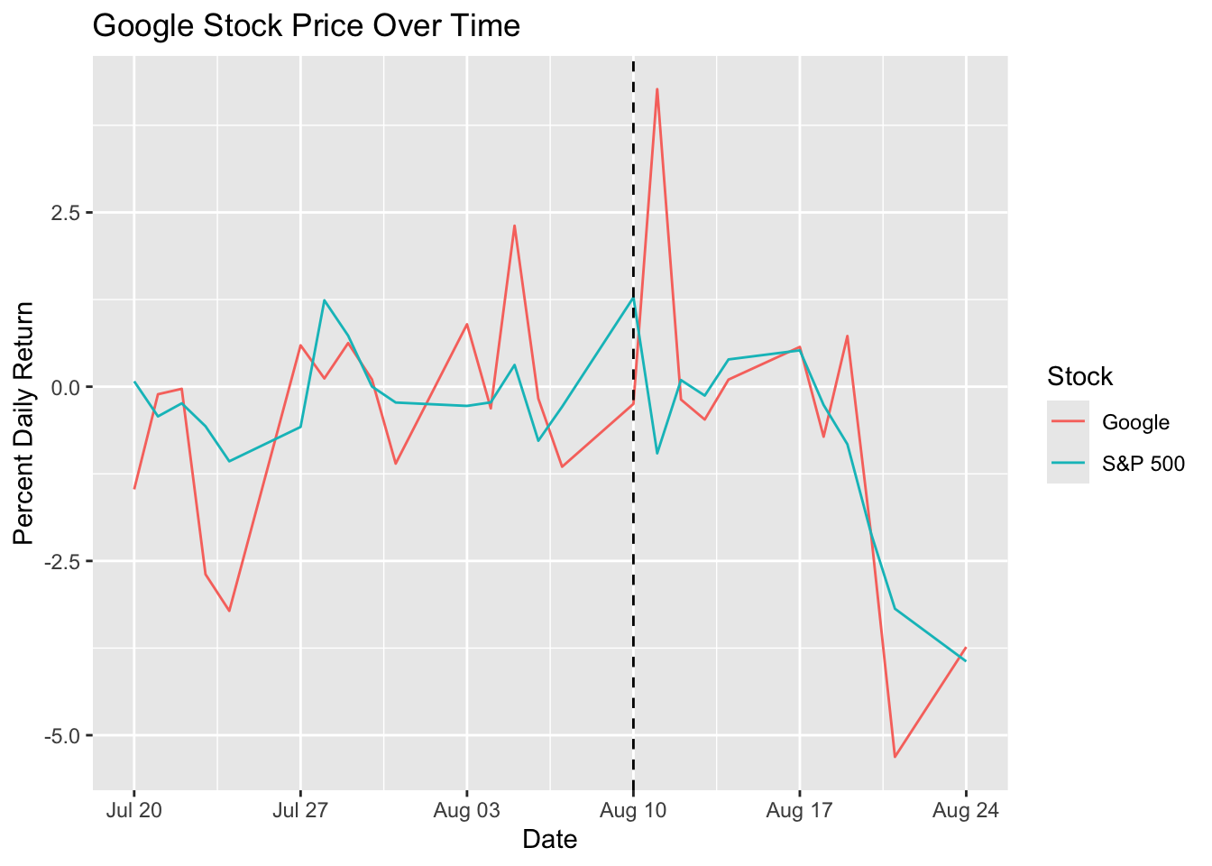
There appears to be a quick spike in the Google price following the intervention, but it isn’t sustained for very long.
In order to fit the CausalImpact model, we’ll do a little data prep and
specify the pre and post periods. In the data,
the response variable (i.e., the first column in data) may contain missing
values (NA), but covariates (all other columns in data) may not.
df <- read.zoo(df_google)
pre_period <- c(index(df)[1], event)
post_period <- c(event + 1, index(df)[nrow(df)])
head(df)
Now we’ll fit the CausalImpact model.
set.seed(123)
impact <- CausalImpact(df, pre_period, post_period)
summary(impact)

# with verbal interpretation
# summary(impact, "report")
Several different stats can be inspected from the model summary. Below is a table of the results and then the interpretation of these metrics.
| Metric | Value |
|---|---|
| Actual (Average) | -0.69 |
| Actual (Cumulative) | -6.88 |
| Predicted (Average) | -1.2 (95% CI: -2.1, -0.35) |
| Predicted (Cumulative) | -12.0 (95% CI: -20.7, -3.46) |
| Absolute Effect (Average) | 0.51 (95% CI: -0.34, 1.4) |
| Absolute Effect (Cumulative) | 5.09 (95% CI: -3.42, 13.8) |
| Relative Effect (Average) | 95% (95% CI: -67%, 88%) |
| Relative Effect (Cumulative) | 95% (95% CI: -67%, 88%) |
| Posterior tail-area probability p-val | 0.114 |
| Posterior prob. of a causal effect | 89% |
Interpretation:
- Actual (Average): the observed average value of your response variable during the post-intervention period.
- Actual (Cumulative): the observed sum of your response variable during the post-intervention period.
- Predicted (Average): the model’s estimated average value of your response variable in the post-intervention period, if the intervention had not occurred (i.e., the counterfactual).
- Predicted (Cumulative): the model’s estimated sum of your response variable in the post-intervention period, if the intervention had not occurred.
- Absolute Effect (Average): Actual (Average) - Predicted (Average)
- Absolute Effect (Cumulative): Actual (Cumulative) - Predicted (Cumulative)
- Relative Effect (Average): Absolute (Average) / Predicted (Average)
- Relative Effect (Cumulative): Absolute (Cumulative) / Predicted (Cumulative)
- Posterior tail-area probability p-val: this p-value is a Bayesian analogue to the frequentist p-value. It represents the probability of observing an effect as large as, or larger than, the one estimated, purely by chance, assuming the null hypothesis of no effect is true.
- Posterior prob. of a causal effect: the posterior probability that the actual effect (positive or negative) is non-zero.
Overall, it appears that there is some evidence of a causal effect, but
it really isn’t strong enough evidence to confidently claim a causal impact.
Each of the reported effects has a confidence interval that goes through
the Null. Next, let’s check out the plotting in CausalImpact.
plot(impact)
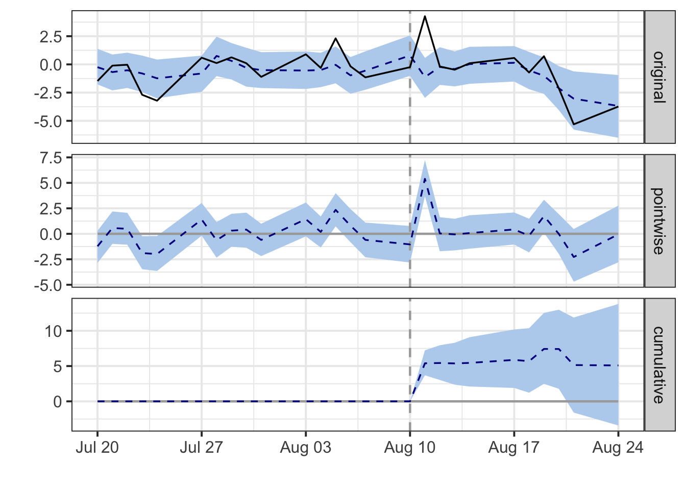
There are three different panels:
- The first panel shows the data and a counterfactual prediction for the post-treatment period.
- The second panel shows the difference between observed data and counterfactual predictions. This is the pointwise causal effect, as estimated by the model.
- The third panel adds up the pointwise contributions from the second panel, resulting in a plot of the cumulative effect of the intervention.
The second and third panel reflect what we previously observed: a quick spike in Google’s stock price, which then quickly converges back to the S&P 500 trend.
To get a little more advanced in the modeling, there are some additional
parameters that users can specify as model.args: niter (default = 1000)
controls the number of MCMC samples to draw and nseasons (default = 1)
controls the period of the seasonal components. Since we’re dealing with
Mon-Fri stock market data here, it may make sense to set this to 5.
impact2 <- CausalImpact(
  df,
  pre_period,
  post_period,
  model.args = list(niter = 5000, nseasons = 5)
)
summary(impact2)
Overall, CausalImpact is a useful tool to have in the causal toolkit when
assessing before-and-after event studies. When this method isn’t suitable,
some alternative options to consider include: difference-in-differences,
regression discontinuity, and traditional interrupted time series.
You can find the full code for this analysis here.